2013年1月16日 星期三

JavaScript Tip: Browser Detection And Redirection


Most Web sites want to attract as many visitors as possible, so developers are motivated to design sites that will be accessible to the largest possible audience. But browser incompatibility problems often make it necessary to design pages for individual browsers.
A JavaScript browser detection and redirection script can improve your visitors' experience by routing them to pages optimized for their particular browser.
Uses For Browser Detection and Redirection
Although it's time-consuming, there are times when you need to design separate pages for specific segments of your audience.
  • WebTV: The current version of WebTV only supports a limited version of JavaScript (called JellyScript), so some of your JavaScripts effects (even simple rollovers) may not work properly. WebTV has a lot of other display differences too. If you expect a lot of visitors using WebTV, test your site on a live system or download the WebTV Viewer to simulate the display.
  • DHTML: Some DHTML effects are coded differently in Netscape and Explorer. In many cases, you can try and include the HTML code for both browsers on the same page. Otherwise, you need to create different pages and route visitors with JavaScript.
  • CSS: Netscape and Explorer also support Cascading Style Sheets (CSS) differently. Here again, you can include instructions for both browsers on a single page. However, if that gets too confusing, route visitors to the appropriate format for their browser using JavaScript.
Browser Detection Scripts
A browser detection script can check for browser types, browser versions, available plug-ins, languages, and platforms. Depending on the purpose, you can have the script write a message to your visitors, notify them about plug-ins required for the site, or automatically redirect visitors to a different Web page.
The first step is to decide which browsers you need to check for. While Netscape and Explorer are the most obvious choices, you should at least consider checking for WebTV if your site is designed to appeal to the consumer audience. While WebTV only has 2 million subscribers at this writing, half of them have purchased online.
The JavaScript code in this example queries the "navigator" object, which contains information about which browser and browser version your visitors are using to view your site. This simple detection script will identify the application name (appName) in use and display an alert box.

<script language="JavaScript" 
type="text/JavaScript">
 if(navigator.appName == "WebTV")
{
 alert("You're using the WebTV browser.")
}
 if(navigator.appName == "Netscape")
{
 alert("You're using a Netscape browser.")
}
 if(navigator.appName == "Microsoft Internet Explorer")
{
 alert("You're using the Internet Explorer browser.")
}
</script>


This script is relatively easy because we're just checking for the browser type, not the individual version (Explorer 5.0, Netscape 4.7, etc.). Detecting browser versions (appVersion) is more tricky. You can download free scripts to detect the version from various JavaScript sites, but the results are often unpredictable. Test them carefully!

Browser Redirection

Telling your visitors which browser they're using is a neat trick, but it's probably something they already know.

The script is more useful when you modify it to redirect users to a page optimized for their particular browsers. While you'll have to spend time optimizing your individual pages, the script itself is very easy:


<script language="JavaScript" 
type="text/JavaScript">
if(navigator.appName == "WebTV")
{
 window.location = "WebTVHome.html"
}
 if(navigator.appName == "Netscape")
{
 window.location = "NetscapeHome.html"
}
 if(navigator.appName == "Microsoft Internet Explorer")
{
 window.location = "ExplorerHome.html"
}
 window.location == "Other.html"
</script>


This script uses IF statements to check for browsers until one returns true. At that point, the visitor is redirected to a page optimized for that browser (using the window.location property). The final window.location statement takes visitors to your default page if all the IF statements return false.

Note: the page names we used in this script are for illustration only. You are free to name your pages anything you want!

So remember: browser detection and redirection is very easy. However, you may increase your workload tremendously if you have to create different versions of every page in your site.
NetMechanic's HTML Toolbox scans your page and alerts you to HTML code that may not display correctly across browsers. Look at your results and make sure that the techniques you want to include are worth the time it will take you to design the alternate pages.

Using the navigator object to detect client's browser


Until one browser remains standing on the web (if ever), browser detection will continue to be part of any good JavaScripter's life. Whether you're gliding a div across the screen or creating an image rollover, it's fundamental that only relevant browsers pick up on your code. In this tutorial we'll probe the navigator object of JavaScript, and show how to use it to perform browser detection, whether the subject is Firefox, Internet Explorer, Opera, etc.

 The navigator object

The navigator object was conceived back in the days when Netscape Navigator reined supreme. These days it serves as much as an irony of Netscape's demise as way of probing browser information.
The navigator object of JavaScript contains the following core properties:
PropertiesDescription
appCodeNameThe code name of the browser.
appNameThe name of the browser (ie: Microsoft Internet Explorer).
appVersionVersion information for the browser (ie: 5.0 (Windows)).
cookieEnabledBoolean that indicates whether the browser has cookies enabled.
languageReturns the default language of the browser version (ie: en-US). NS and Firefox only.
mimeTypes[]An array of all MIME types supported by the client. NS and Firefox only.
platform[]The platform of the client's computer (ie: Win32).
pluginsAn array of all plug-ins currently installed on the client. NS and Firefox only.
systemLanguageReturns the default language of the operating system (ie: en-us). IE only.
userAgentString passed by browser as user-agent header. (ie: Mozilla/5.0 (compatible; MSIE 9.0; Windows NT 6.1;)You can probe the userAgent property for mobile browsers such as iPhone, iPad, or Android. The following variable returns true if the user is using one of the following mobile browsers:
//returns true if user is using one of the following mobile browsers
var ismobile=navigator.userAgent.match(/(iPad)|(iPhone)|(iPod)|(android)|(webOS)/i)
userLanguageReturns the preferred language setting of the user (ie: en-ca). IE only.
Let's see exactly what these properties reveal of the browser you're currently using:
appCodeName: Mozilla
appName: Netscape
appVersion: 5.0 (Windows NT 6.1; WOW64) AppleWebKit/537.17 (KHTML, like Gecko) Chrome/24.0.1312.52 Safari/537.17
userAgent: Mozilla/5.0 (Windows NT 6.1; WOW64) AppleWebKit/537.17 (KHTML, like Gecko) Chrome/24.0.1312.52 Safari/537.17
platform: Win32

 At a glance

At a glance at the above table, you may be swayed towards turning to the following two properties to do your browser detection bidding:
navigator.appName
navigator.appVersion
After all, you are trying to detect a browser's name and version right? However, they both will most likely mislead you. In browsers such as various versions of Netscape and Firefox, these two properties return simply "Netscape" for appName, and 5.0 for appVersion without any further distinction for Firefox and its version, and hence are pretty much useless in the real world. For example, in both Firefox 4.x and Firefox 5.x, these two properties return:
appName: Netscape
appVersion: 5.0 (Windows)
We need to turn to a property that's more thorough in its investigative work if we want more consistency and accuracy, and that turns out to be navigator.userAgent.

 Detecting Firefox x.x

In Firefox 2.0.0.13 for example, the userAgent property reads:
UserAgent: Mozilla/5.0 (Windows; U; Windows NT 5.1; en-US; rv:1.8.1.13) Gecko/20080311 Firefox/2.0.0.13
And in Firefox 5.0:
UserAgent: Mozilla/5.0 (Windows NT 6.1; WOW64; rv:5.0) Gecko/20100101 Firefox/5.0
The detail we're interested in apparently lies at the very end, or Firefox/5.0 for example. Different versions of Firefox will contain a different version number, but the pattern is consistent enough. The part we're interested in occurs after the string "Firefox/", or the exact version number. There are many ways to get to it using either standard String or RegExp methods- I'm opting for the later here:
<script type="text/javascript">

if (/Firefox[\/\s](\d+\.\d+)/.test(navigator.userAgent)){ //test for Firefox/x.x or Firefox x.x (ignoring remaining digits);
 var ffversion=new Number(RegExp.$1) // capture x.x portion and store as a number
 if (ffversion>=5)
  document.write("You're using FF 5.x or above")
 else if (ffversion>=4)
  document.write("You're using FF 4.x or above")
 else if (ffversion>=3)
  document.write("You're using FF 3.x or above")
 else if (ffversion>=2)
  document.write("You're using FF 2.x")
 else if (ffversion>=1)
  document.write("You're using FF 1.x")
}
else
 document.write("n/a")

</script>
Output: n/a
Basically, I'm capturing just the versonMajor.versionMinor portion of the full version number of Firefox (ie: 2.0.0.13 becomes simply 2.0), and using that as basis to detect the various versions of Firefox. Delving any deeper, and the returned version may no longer be a number but a string (ie: 2.0.0), which makes numeric comparisons cumbersome.

 Detecting IE x.x

In IE 7.0 for example, the userAgent property reads:
UserAgent: Mozilla/4.0 (compatible; MSIE 7.0; Windows NT 5.1; .NET CLR 2.0.50727)
So the part we're interested in lies in the middle, or MSIE 7.0;. If you try a shortcut and use parseFloat on the entire string to get to the 7.0 portion, it won't work. This is due to the way parseFloat works- by returning the first number it encounters, which in this case is 4.0. Once again we need to use either standard String or RegExp methods again to get to the actual version number; below I'm using RegExp as well:
<script type="text/javascript">

if (/MSIE (\d+\.\d+);/.test(navigator.userAgent)){ //test for MSIE x.x;
 var ieversion=new Number(RegExp.$1) // capture x.x portion and store as a number
 if (ieversion>=9)
  document.write("You're using IE9 or above")
 else if (ieversion>=8)
  document.write("You're using IE8 or above")
 else if (ieversion>=7)
  document.write("You're using IE7.x")
 else if (ieversion>=6)
  document.write("You're using IE6.x")
 else if (ieversion>=5)
  document.write("You're using IE5.x")
}
else
 document.write("n/a")
</script>
Output: n/a

 Detecting Opera x.x

Detecting Opera using the navigator object at first appears to be tricky business due to the browser's identity crisis. You see, Opera 8 and below by default identifies itself as IE6 (or lower) in the navigator object. Users can override this setting under "Edit Site Settings" in the toolbar to identify as Opera or even another browser instead. Starting in Opera 9, the browser regains its confidence and identifies by default as itself, Opera, though users can still modify this setting manually in the toolbar. The bottom line is, Opera can appear as either Opera, Internet Explorer, or another browser within a designated list in the navigatorobject.
Lets take a look at what navigator.userAgent in Opera 8.5 returns depending on what it has chosen to identify itself as (whether automatically or manually):
As IE6: Mozilla/4.0 (compatible; MSIE 6.0; Windows XP) Opera 8.5 [en]
As Moz5: Mozilla/5.0 (Windows XP; U) Opera 8.5 [en]
As Opera: Opera/8.5 (Windows XP; U) [en]
Notice how if it's set to identify as IE, MSIE 6.0 appears within the string, while if set to identify as Mozilla, Mozilla/5.0 appears instead. As Opera itself, Opera/8.5 appears. In all three cases, the one commonality that we can exploit to actually detect Opera and its true version regardless of which identify it's decided to take on is the string "Opera x.x" or "Opera/x.x" within navigator.userAgent. In other words, there are two versions of the target string we need to be aware of. With that said, here's how you might go about testing for a specific version of Opera, which turns out to be no different than the technique used for detecting, say, Firefox:
<script type="text/javascript">
//Note: userAgent in Opera9.24 WinXP returns: Opera/9.24 (Windows NT 5.1; U; en)
//         userAgent in Opera 8.5 (identified as IE) returns: Mozilla/4.0 (compatible; MSIE 6.0; Windows NT 5.1) Opera 8.50 [en]
//         userAgent in Opera 8.5 (identified as Opera) returns: Opera/8.50 (Windows NT 5.1; U) [en]

if (/Opera[\/\s](\d+\.\d+)/.test(navigator.userAgent)){ //test for Opera/x.x or Opera x.x (ignoring remaining decimal places);
 var oprversion=new Number(RegExp.$1) // capture x.x portion and store as a number
 if (oprversion>=10)
  document.write("You're using Opera 10.x or above")
 else if (oprversion>=9)
  document.write("You're using Opera 9.x")
 else if (oprversion>=8)
  document.write("You're using Opera 8.x")
 else if (oprversion>=7)
  document.write("You're using Opera 7.x")
 else
  document.write("n/a")
}
else
 document.write("n/a")
</script>
Output: n/a

 Conclusion

We've seen how to use navigator to detect the browser type of your visitors. If the potential pitfalls and complexity of usage of it is a little too much for you, an alternative is to use Object Detection. Whichever method you choose, just be sure to choose one!
2013年1月10日 星期四

Prepositions in expressions of time


PrepositionUseExamples
in monthsin July; in September
yearin 1985; in 1999
seasonsin summer; in the summer of 69
part of the dayin the morning; in the afternoon; in the evening
durationin a minute; in two weeks
part of the dayat night
time of dayat 6 o'clock; at midnight
celebrationsat Christmas; at Easter
fixed phrasesat the end of the week
at the same time
days of the weekon Sunday; on Friday
dateon the 25th of December*
special holidayson Good Friday; on Easter Sunday; on my birthday
a special part of a dayon the morning of September the 11th*
later than sth.after school
how far sth. happened (in the past)6 years ago
earlier than sth.before Christmas
time that separates two pointsbetween Monday and Friday
not later than a special timeby Thursday
through the whole of a period of timeduring the holidays
period of timefor three weeks
two points form a periodfrom Monday to Wednesday
from Monday till Wednesday
from Monday until Wednesday
time of the day23 minutes past 6 (6:23)
point of timesince Monday
no later than a special timetill tomorrow
until tomorrow
time of the day23 minutes to 6 (5:37)
not more than a special timeup to 6 hours a day
during a period of timewithin a day

2013年1月3日 星期四

Different Stylesheets for Differently Sized Browser Windows


Otherwise known as "resolution dependent layouts". Single website, different CSS files for rearranging a website to take advantage of the size available.
There is a W3C standard way of declaring them. One way is to test the "device-width", like this:
<link rel="stylesheet" media="screen and (min-device-width: 800px)" href="800.css" />
The above code will apply the 800.css styling to the document only if the device viewing it has a width of 800px or wider. And... supports "media queries" in this way.
Keep in mind this is the device width, not the current width of the browser window. On the iPhone (3G(s)), that means 480px. My fancy new MacBook Pro is going to return 1920px for the device width. But my actual browser window is only half of that at this exact moment. The device width is quite useful when dealing with mobile devices where the browser is probably 100% of the screen whenever in use, but less useful in laptop/desktop browsers.
Seems to me far more useful is the current width of the browser window ("viewport"). We can even specify stylesheets that are only to be used when the viewport is between two different pixel sizes:
<link rel='stylesheet' media='screen and (min-width: 701px) and (max-width: 900px)' href='css/medium.css' />
That stylesheet will only take affect when the current browser window is between 701 and 900 pixels in width.

Browser Support

IE 9+, Firefox 3.6+, Safari 3+, Any Chrome, Opera 10+. Mozilla suggests starting the media attribute of the <link /> with "only" which will hide the stylesheet from older browsers that don't support media queries. That may or may not be what you actually want to do... case dependent of course.
<link rel="stylesheet" media="only screen and (color)" href="example.css" />
Generally, layout is one of those things that it's tough to sell "progressive enhancement" on. Rounded corners becoming squares, no big deal. Messed up layout, that is a big deal. Devices like the iPhone right now are kind of great, since browser choice is so limited (there used to be just Mobile Safari and that's it, now there is Opera as well) and they are very good browsers, you can rely on techniques like this to work.
If IE support is paramount, we always have JavaScript!

Doing it with jQuery

Using JavaScript, we can test the windows width and change the active CSS file accordingly. This will work across all browsers. You can have an ID for a <link /> element like any other, so let's add that:
<link rel="stylesheet" type="text/css" href="main.css" />
<link id="size-stylesheet" rel="stylesheet" type="text/css" href="narrow.css" />
Then we can use that as a hook and change the href value of the stylesheet. The browser will see that change and unapply the old CSS and reapply the newly linked CSS. We'll run our little adjustment test once right away, and then anytime the window is resized thereafter.
function adjustStyle(width) {
    width = parseInt(width);
    if (width < 701) {
        $("#size-stylesheet").attr("href", "css/narrow.css");
    } else if ((width >= 701) && (width < 900)) {
        $("#size-stylesheet").attr("href", "css/medium.css");
    } else {
       $("#size-stylesheet").attr("href", "css/wide.css"); 
    }
}

$(function() {
    adjustStyle($(this).width());
    $(window).resize(function() {
        adjustStyle($(this).width());
    });
});

Is jQuery really necessary just for this?

No, but I'm sure you know that's just how I roll in general and it makes it easier. Kevin Hale wrote about dynamic resolution layouts literally five years ago. It's "raw" JavaScript and still works great today.
Also, there is a kick ass polyfill: Respond.js

Example One
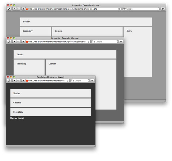
This one has a special stylesheet for narrow (less than 700px), medium (701 - 900px), and wide (greater than 901px) browser windows.

Example Two

This does the exact same thing as example one, only through jQuery/JavaScript instead of CSS media queries.

Example Three

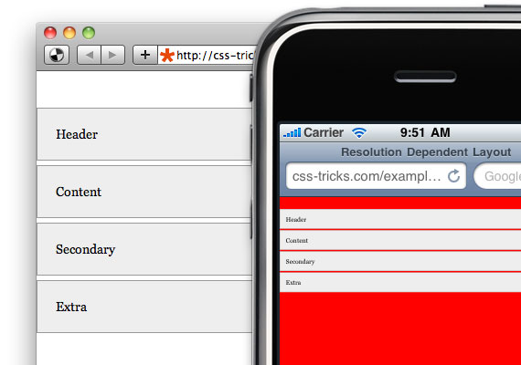
This example shows that we can target mobile devices by testing for a maximum device width.

Download

Snag all of these for reference in one place.